Visualize, track, and optimize multi-stage processes with high-fidelity network modeling.
1. End-to-End Distributed Bio-Logistics Flow
Operational transparency in personalized cellular therapy relies on the precise, quantitative tracking of the complete patient-sample lifecycle. This multi-layered network model maps the time-sensitive movement of autologous treatments – from initial cell collection at an Apheresis center, through intermediate cryogenic processing hubs and specialized manufacturing facilities, ensuring full visibility of the entire operational chain.
2. Clinical Trial Cohort Traceability Model
The efficacy of precision oncology research relies on the systematic clustering of heterogeneous patient groups based on defined molecular and genomic profiles. This multi-layered model provides a structured mapping of patient movement from initial diagnosis and biomarker identification, through clinical phase and treatment arm allocation, down to toxicity profiles, clinical response rates, and long-term survival outcomes.
3. Supply Chain Serialization & Disposition Model
The integrity of global pharmaceutical supply chains requires rigorous, end-to-end oversight of all manufacturing and distribution network nodes. This multi-layered model monitors individual drug batches from their origin and active pharmaceutical ingredient (API) profiles, through regulatory compliance and manufacturing checkpoints, down to final distribution, quality control disposition, and end-market delivery.
Biologic Lifecycle and Chain-of-Custody (CoC) System
This Sankey unpacks complex, multi-input and multi-output pharmaceutical supply and clinical trial intersections using a Sankey diagram. It maps out how various active pharmaceutical ingredient (API) resource inputs from different manufacturing countries flow through specific regulatory approval pathways, eventually reaching distinct clinical patient outcomes.
By selecting a specific bridging node – as demonstrated with “Standard Contract Mfg” in the image – the system instantly isolates its dedicated supply-and-demand network. This clarifies its exact operational footprint by highlighting relevant streams while fading out the rest of the broader data context.
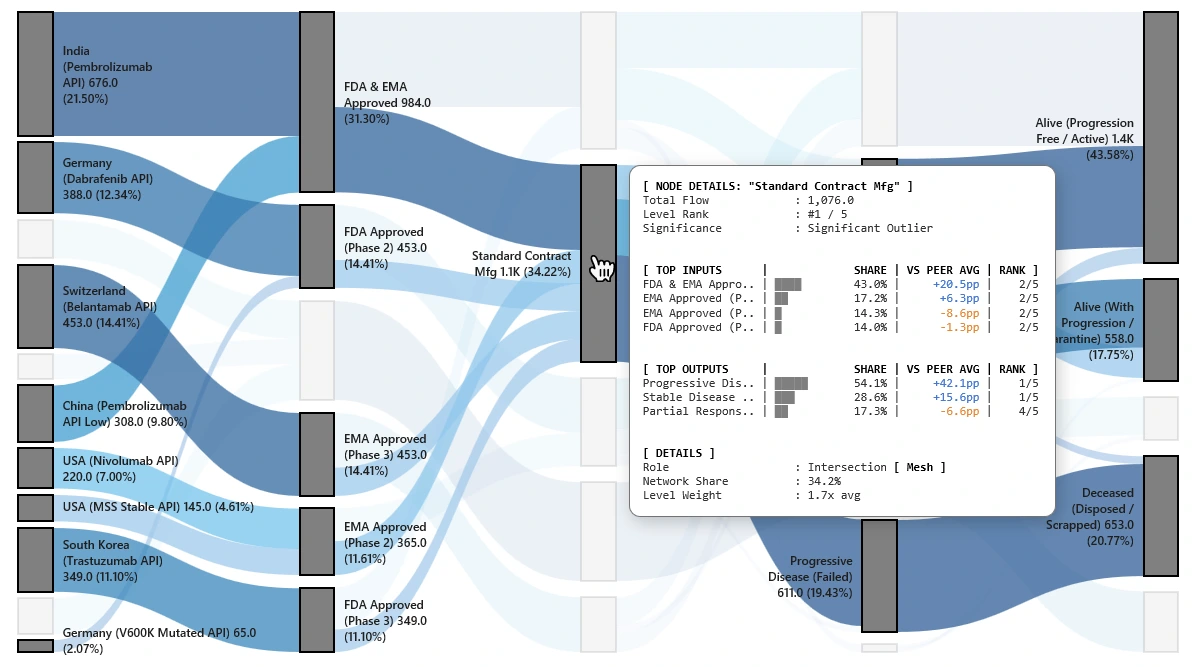
- General Metrics: Displays the node’s absolute volume (Total Flow: 1,076.0), its structural hierarchy on that specific tier (Level Rank: #1 / 5), and flags it as a Significant Outlier.
- Top Inputs: Ranks the contributing regulatory pathways feeding into this manufacturing node (e.g., FDA & EMA Approved, EMA Approved Phase 2), alongside their percentage share and precise peer benchmarking (VS Peer Avg in percentage points).
- Top Outputs: Identifies where the node’s processed volume is directed downstream into patient clinical statuses (such as Progressive Disease, Stable Disease, and Partial Response), including percentage point comparisons against the average.
- Operational Details: Classifies the functional role of the node (Intersection [ Mesh ]), its total Network Share (34.2%), and its level weight relative to the average (1.7x avg).
Biologic Chain-of-Custody (CoC) System: Predictive View / Downstream
This visualization transforms a supply-chain diagram into a powerful, dynamic decision-making tool, allowing you to instantly visualize the predictive performance of your manufacturing network. By isolating a central node, like ‘Standard Contract Mfg’ as shown in the highlighted flow, users can trace its entire downstream influence on clinical outcomes and costs. This dynamic “Predictive View” reveals:
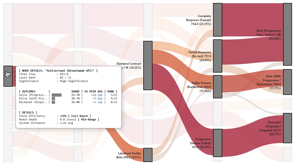
- Traceable Clinical Impact: See exactly how processing choices at a specific node correlate with final clinical states. The top call-outs show the entire distribution of outcomes (e.g., identifying that this contract manufacturer drives +20.5pp better rate of ‘Alive’ outcomes for its primary flow).
- Actionable Performance Drivers: The details panel breaks down why a node is a ‘Significant Outlier’ and has high ‘System Influence’ (1.7x avg). Compare its full downstream yield against the system average (VS Peer Avg) to validate partners, optimize processes, and manage risks with data.
- Operational Optimization: The ‘System Influence’ metric quantifies the processing node’s total impact on the entire ecosystem, prioritizing process improvements and control point optimization for maximum total-system ROI.
This isn’t just tracking a product; it’s understanding the performance determinants from process to patient to build a truly resilient and effective chain-of-custody.
Biologic Chain-of-Custody (CoC) System: Upstream Root-Cause Analysis
This view transforms the network map into a diagnostic tool, allowing you to trace backwards from any intermediate facility or outcome to identify its exact upstream origins.
By selecting a bridging node – demonstrated here with “Lakefront Joint Venture” – the system isolates its upstream supply paths and strips away network noise. This dynamic “Root-Cause” view reveals:
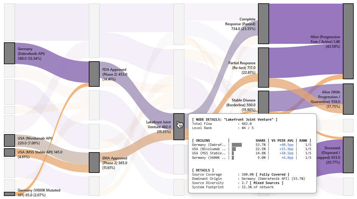
- Traceable Source Accountability: Pinpoint exactly which raw drug substances, manufacturing sites, and regulatory pathways feed into a specific facility. The map clearly highlights the historical footprint, tracking the volume all the way back to the original source countries.
- Upstream Composition Drivers: The details panel breaks down the precise makeup of the selected node under
[ ORIGINS ]. It ranks the contributing components (e.g., Germany – Dabrafenib API at 53.7%) and benchmarks their presence against peer averages, instantly exposing over-indexed supply dependencies. - Supply Diversity & Dominance Insights: Metrics like ‘Source Coverage’ (100% Fully Covered), ‘Dominant Origin’, and ‘Source Diversity’ give procurement and quality teams the exact data needed to mitigate single-source vulnerabilities and audit compliance risk.
This isn’t just mapping a pipeline; it’s an engineering-grade diagnostic for isolating the root causes of downstream quality, regulatory, or volume deviations.