Mapping Environmental & Energy Networks with Total Visibility
1. Carbon Footprint Tracking
Compliance models like CSRD demand absolute transparency. By mapping Scope 1, 2, and 3 emissions down to individual process layers and regional impact zones, sustainability teams can instantly audit multi-tiered supply chain networks and pinpoint hidden carbon concentrations.
2. Strategic Energy Budgeting
Where corporate finance meets resource procurement. Visually balance your energy asset portfolio, weigh fixed-price contracts against spot markets, and track how budget allocations cascade through conversion technologies directly into operational infrastructure.
3. Operational Energy Flow
A deep-dive engineered view of physical infrastructure. Trace raw energy sources as they transform into carriers like electricity, heat, or hydrogen, exposing system bottlenecks, conversion inefficiencies, and end-use sector losses in real time.
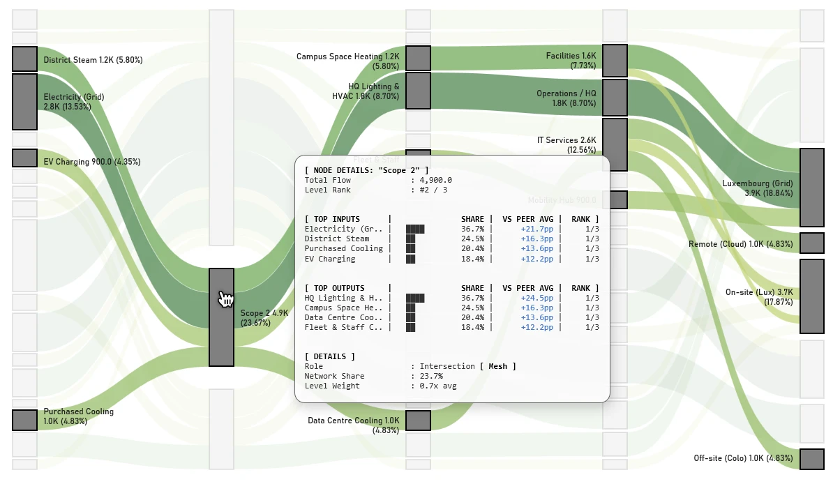
Carbon Footprint Tracking: Node-Level Deep Dives
This visualization unpacks complex, multi-input and multi-output emission intersections – classified here as a ‘Mesh’ role. Selecting a bridging node like Scope 2 instantly isolates its specific supply-and-demand network, clarifying its exact operational footprint without losing the broader data context.
The detailed panel exposes the node’s internal dynamics, providing a clear ranking of Top Inputs (e.g., grid electricity, district steam) and Top Outputs (e.g., HQ lighting, data centers). This eliminates manual data aggregation, giving leadership direct access to strategic metrics like total network share (23.7%) and precise peer benchmarking (+21.7pp). These node-level insights enable data-driven, targeted carbon optimizations across the enterprise.
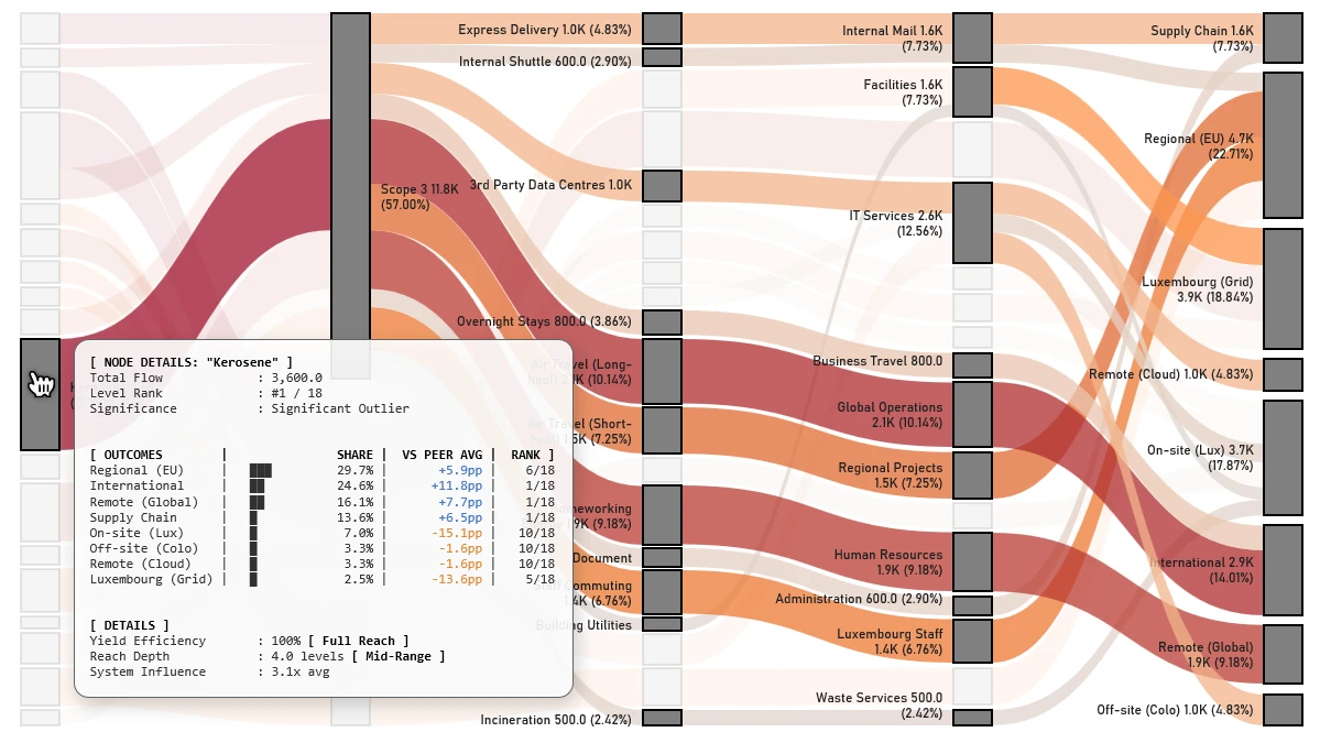
Carbon Footprint Tracking: Unmasking Hidden Cost Drivers
The Sankey diagram tracks carbon footprint drivers, focusing on the specific impact of outliers. Selecting the ‘Kerosene’ node highlights its entire downstream flow in red, revealing the cascading effect of this emission source. The visualization traces the flow through operational tiers – such as ‘Business Travel’ and ‘Human Resources’ – directly into final impact zones like ‘Regional (EU)’ and ‘Luxembourg Staff’. A detailed popup quantifies the node’s metrics, identifying it as a ‘Significant Outlier’ with a system influence 3.1 times the network average.
Energy Infrastructure Oversight: From Generation to Grid Demand
This visualization tracks energy transformation across complex utility networks. Isolating the ‘Generation’ intersection maps the exact flow of diverse renewable and thermal inputs directly toward final industrial and residential demand.
The structural breakdown instantly exposes the composition of this macro-level phase:
- Top Inputs: Quantifies the raw energy mix by volume – led by Solar (39.3%) and Geothermal (27.0%).
- Top Outputs: Details how pooled energy is distributed to downstream infrastructure layers, such as PV Plants (25.8%) and Deep Well Systems (18.0%).
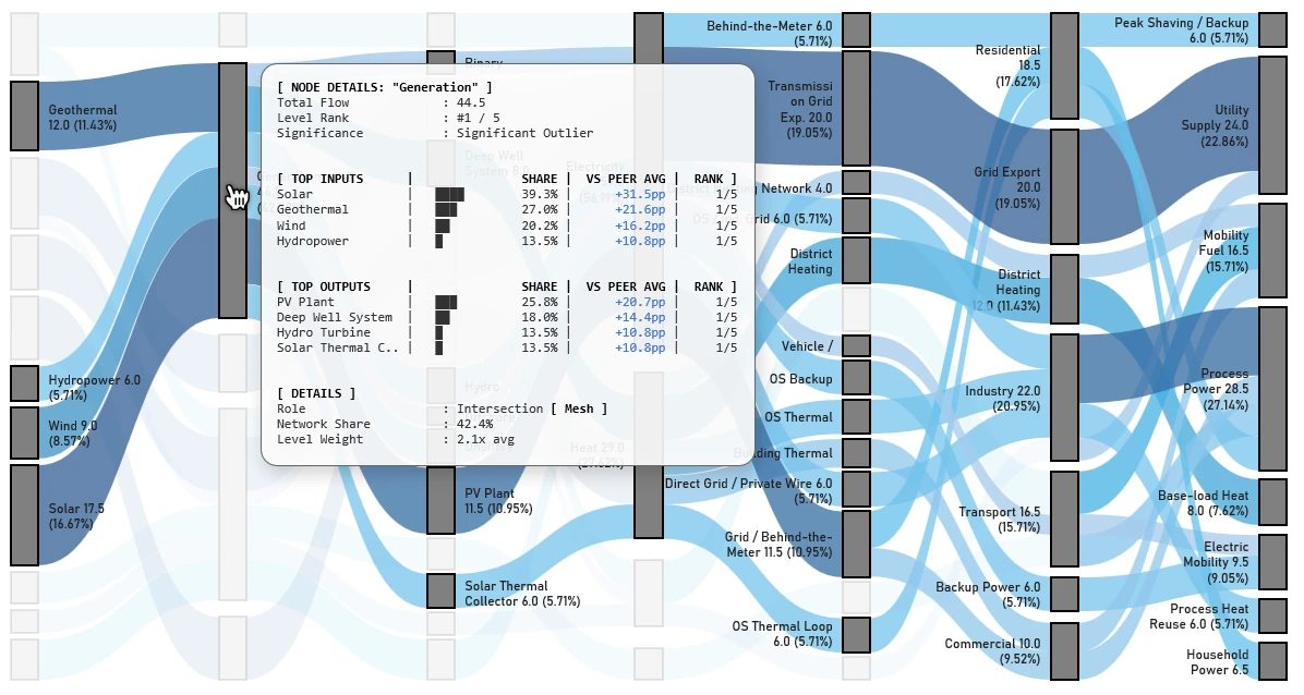
The data reveals this node commands a 42.4% network share, operating as a significant outlier at 2.1x the average system weight. By bridging the gap between macro-level portfolio tracking and micro-level transmission logic, it provides leadership with complete clarity over generation pathways, resource allocation, and system inefficiencies.